When a visitor clicks on your banner ad and lands on your landing page, you have between three and eight seconds to grab attention.
How would you do it?
By using so-called effective sales tactics to build urgency in the hope that the visitor falls for it?
Or by demonstrating that you can be trusted with the visitor’s personal information?
Exaggerating or overstating your offerings may fool visitors once, but when they realize that you cannot deliver what you promised they will not return.
Your visitors should understand that your business is authentic and you have a credible offer.
Unfortunately, many businesses resort to sales gimmicks or switch and bait techniques to get visitors to part with their information. This information is either sold or used to spam people with irrelevant emails and calls.
So, you now have a sales pitch-weary visitor to win over with the right landing page characteristics that engender trust.
Get long-term ROI.
We help you grow through expertise, strategy, and the best content on the web.
How to build trust on a landing page:
Let’s look at some effective ways you can incorporate trust elements in the design of your landing page.
1. Maintain a professional design
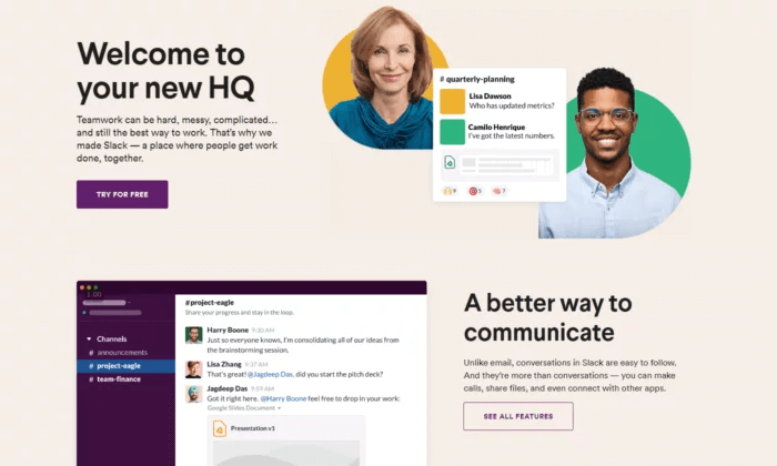
Does your landing page look professional?
Or does it look like a child designed it?
First impressions matter, and using a trusted landing page tool is just what you need. You are more likely to give a smartly dressed salesperson a patient hearing than a casually dressed one.
It may be tempting to use a lot of colors and fonts to make your page stand out. But you don’t want to give your visitors the impression that you’re an amateur. That is the main reason why using tools such as Toptal’s CSS3 generator tool to generate stylesheets for your site will make your work easier.
Use no more than three different colors and fonts to ensure your landing page design is easy on the eyes and looks put together. Also, use contrasting colors for easy reading.
Focus on spelling, punctuation, and grammar as well. If your copy is full of mistakes, your landing page could resemble a phishing attempt.
People are already afraid of personal information theft. Don’t give them a reason to abandon your page within seconds of landing on it.
Flashing animations have a place but it is not on your landing page. They contribute to the amateurish, fake look and put off visitors.
A neat and clean layout with lots of negative space will bring more conversions than a busy plan with clashing colors and too much happening at the same time.
You can use a landing page builder and a business name generator to help you redesign your landing page and strategically place trust signals to help visitors believe in you.
To create customizable landing pages that rank on google, try a Headless CMS– both marketers and developers prefer this headless architecture to traditional website builders
2. Display testimonials and reviews
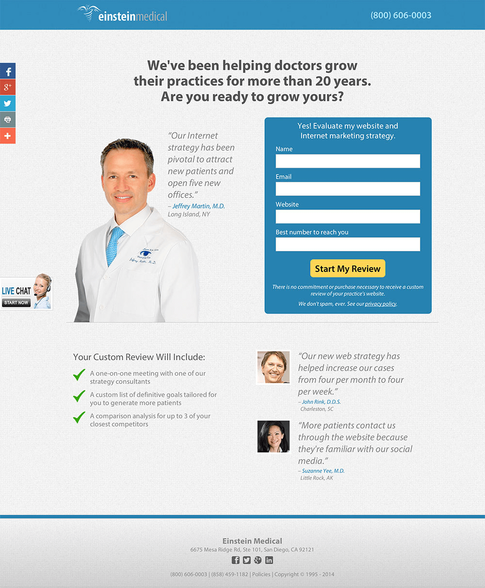
Third-party social proof is a powerful motivator.
It adds credibility to your landing page by telling your visitors that other people have found you trustworthy and beneficial.
Pick reviews and testimonials that show how your product or service benefited your customers or solved their problems. If you have reputable organizations as clients, highlight their reviews.
Landing pages that display social proof convert 1.1% better than those that don’t.
But do not fake your testimonials or hire someone to write reviews. When customers find out (and they will!), your reputation will be irreversibly damaged.
A good spot to place endorsements from happy customers is right below the contact form, which will encourage people to click on the CTA button.
3. Use concise lead capture forms
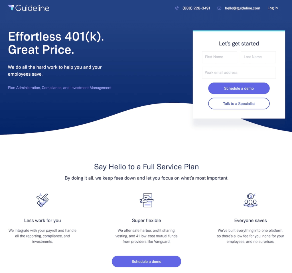
A Contact Us form or a Sign-Up form is a good way to collect information about your visitors.
But remember that most people are wary of parting with their contact details so do not ask for too much information. Have a conversation with your sales team and marketing team to determine what is “nice-to-have” and what is “need-to-have.”
Your landing page is probably the first time a visitor has had contact with you, so thrusting an intrusive form into their faces will set off red flags in their minds.
Also, the longer the form, the less likely it is to be filled and consequently, the lower your conversion rates will be.
- Landing pages that ask for name and gender have very poor conversion rates of 5%-6%.
- On the other hand, landing pages that ask only for email and phone numbers have a 10.15% conversion rate.
Limit your form to three fields that ask for relevant and necessary information.
If you cannot fit all the required information in three fields, use a progress bar to break up the form into easily manageable parts that will not overwhelm your visitors.
- Multi-step landing page forms get up to 300% more conversions!
Build trust with your visitors first; you can collect more information from them later in the buyer journey.
4. Use cohesive messaging and personalized CTAs
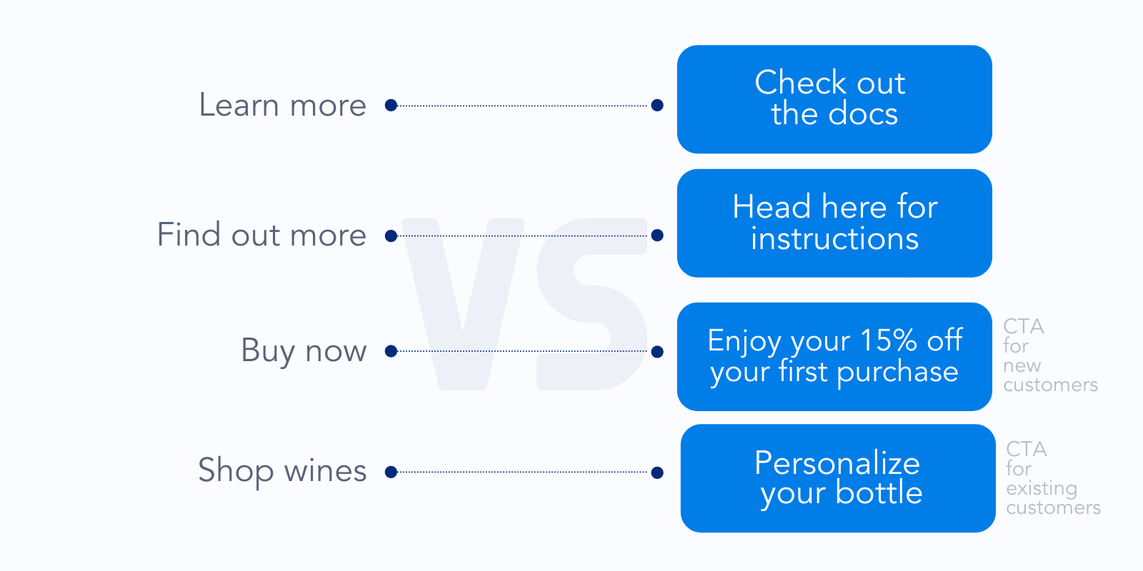
All the elements on your landing page, both design and psychological, should come together to present a streamlined image.
a. Matching messages:
The messaging in your PPC ad and your landing page should match in terms of:
- Headline
- Imagery
- Brand colors
This will reassure your visitors that they have arrived at the correct page and avoid confusion.
Study color psychology to understand how you want people to perceive your brand. Remember, trust is all about perception.
Use the same message across your ads, emails, and landing pages to create a congruent picture that assures visitors that you’re delivering what you promised.
b. Clear copy
Don’t use too much industry jargon or verbose language. Keep your copy direct, simple, and clear.
c. No clutter
Remove all distractions like header links or navigation menus so that visitors focus on the form. This is called isolation.
If required, you could place a link in the footer, away from the headline and the form.
d. Personalized CTA
A personalized call-to-action (CTA) converts 202% times better than a default one. That’s because visitors want to be sure that they will not be bombarded with irrelevant messages.
Your CTA should also be relevant and specific to your visitors. It should tell them what they’ll get if they click on the button, not what you want them to do.
E.g.
Vague CTA = Sign up now
Specific CTA = Sign up to know how to improve conversions by 25%
5. Employ a live chat tool
Allow your visitors to get more information about you any time they want through a live chat tool or interactive on-page content.
This encourages those visitors who don’t want to give away their email address or phone number to speak to you without hesitation.
It also allows you to explain your product and service in greater detail, especially if it’s complicated.
Include a headshot and the name of the customer support executive to make your visitors feel like they’re talking to a human.
Avoid pop-ups whenever possible because they tend to annoy people and increase your bounce rates.
6. Display your contact information
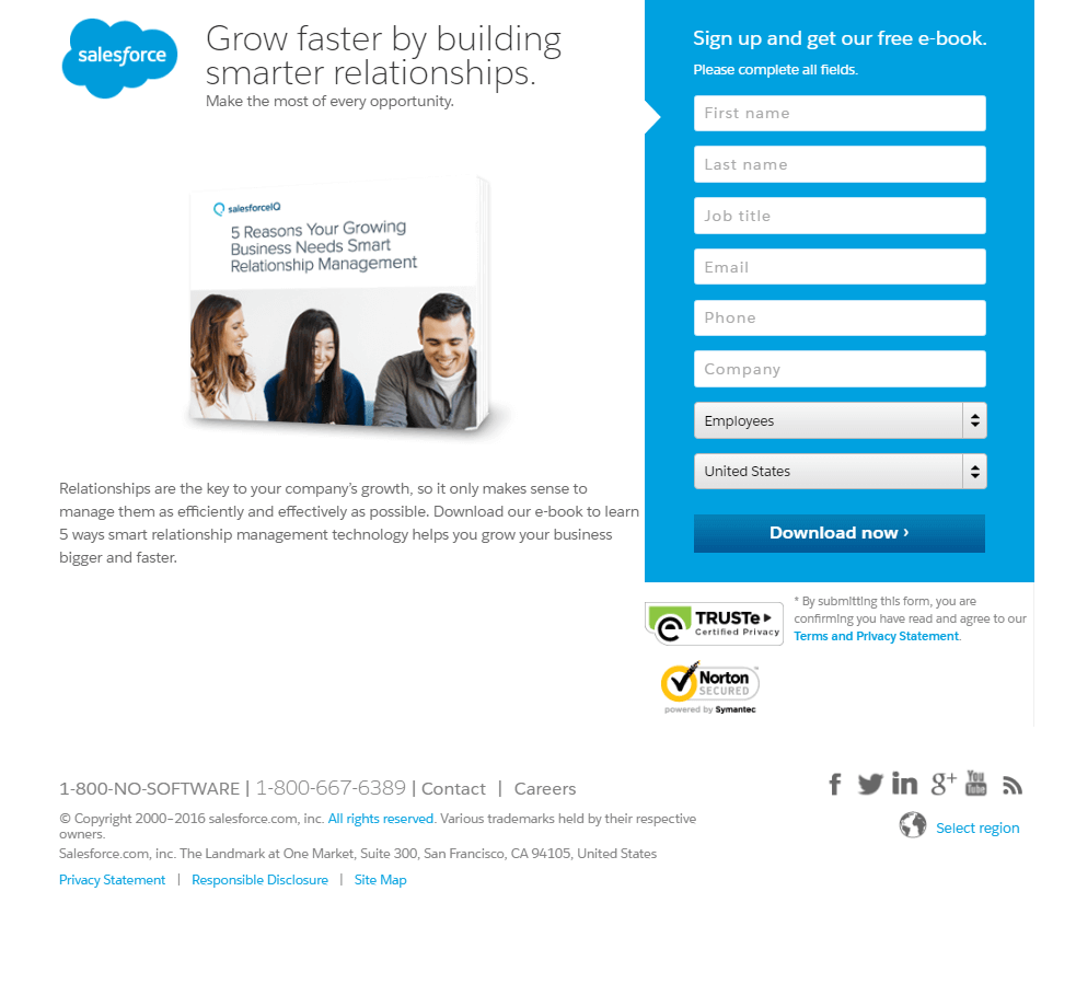
Your visitors are not likely to call you using the phone number on the landing page, but having that information visible tells them that there are actual people behind the business.
It signals to them that you are a genuine business. This is especially important if you are an e-commerce business where visitors are required to conduct financial transactions.
Provide your email ID, phone number, and address with a Google Maps listing, if possible.
A study by Nifty revealed that 42% of top landing pages displayed their name, address, and phone number.
7. Display trust badges
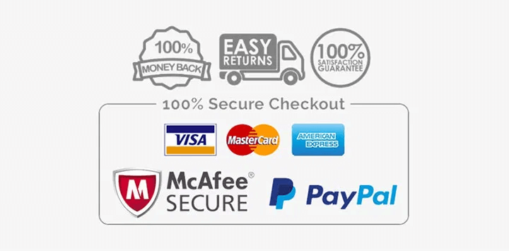
Just like third-party social proof tells visitors they can trust you, so do third-party company logos and certification logos.
Display certification logos (variously called trust badges or security badges) like VeriSign, McAfee, Truste, or The Better Business Bureau to visually demonstrate that reputed certification organizations are vouching for you.
If you’re an e-commerce business, trust badges are a must to signal to visitors that it is safe to conduct financial transactions on your site.
If you have partner companies, consider co-branding by displaying their logos.
Don’t place fake logos because customers are known to click on them to verify if you’re really certified.
8. Feature your privacy policy link
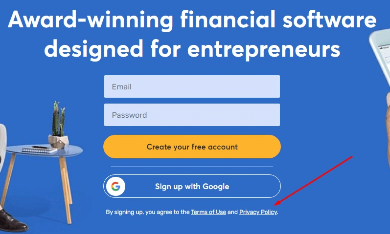
Visitors may not read your privacy policy, just like they may not call you using your contact address.
But when you feature your privacy policy link on your landing page, you are being transparent about how you collect and use visitor data.
Many people are afraid of what businesses will do with their private information. Your privacy policy is a way of assuring them that you will not spam them with junk emails or sell their personally identifiable information to the highest bidder thus ensuring you are protecting private information.
Conversion rates can increase if you address customer fears right on your landing page.
By being open about how you process data, you earn greater trust.
Summing up
Business owners who create professional landing pages that live up to their promise get more conversions than others. Being honest, transparent, and upfront about your offerings helps you gain the trust of your customers.


